Clos des Saumanes
- Client
- Clos des Saumanes
- Discipline
- Brand & Graphic Design
- Services
- Visual identity, Brand guidelines, Packaging design, Art direction, 3D imagery
- Year
- 2026
- Location
- Châteauneuf de Gadagne, France
The estate already had the place, the light and the moments. It needed an identity that could bring them together.
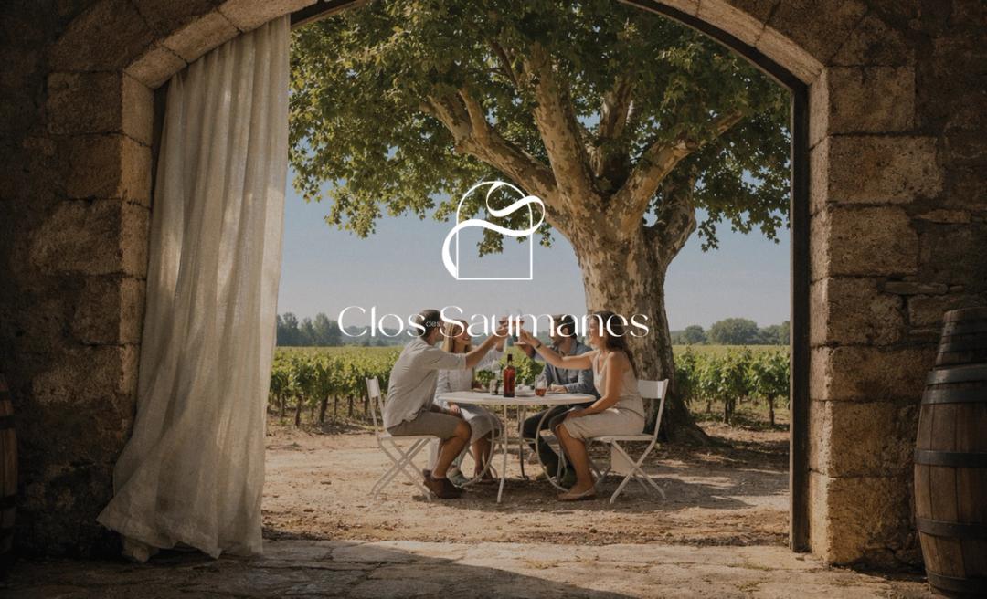
Bring the place into the brand.
Clos des Saumanes already had character. We gave it an identity. Shared tables, linen in the breeze, southern light: the brand’s visual cues come from the estate.
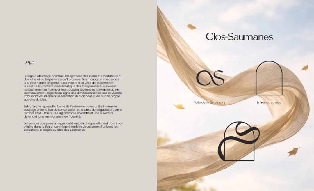
A mark born from the place.
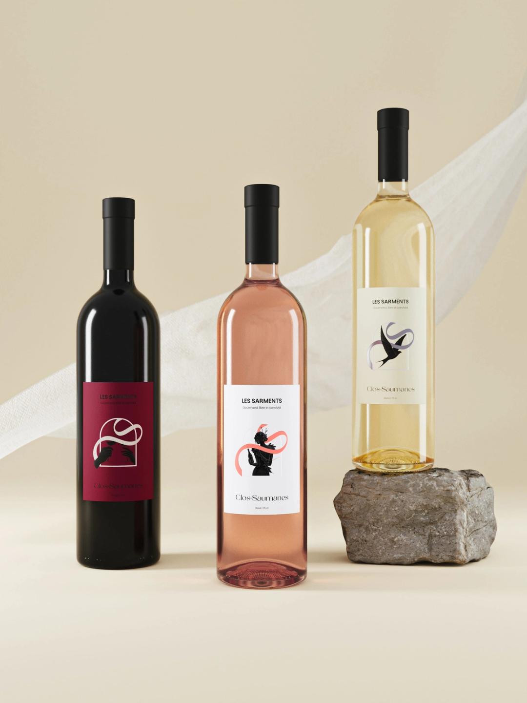
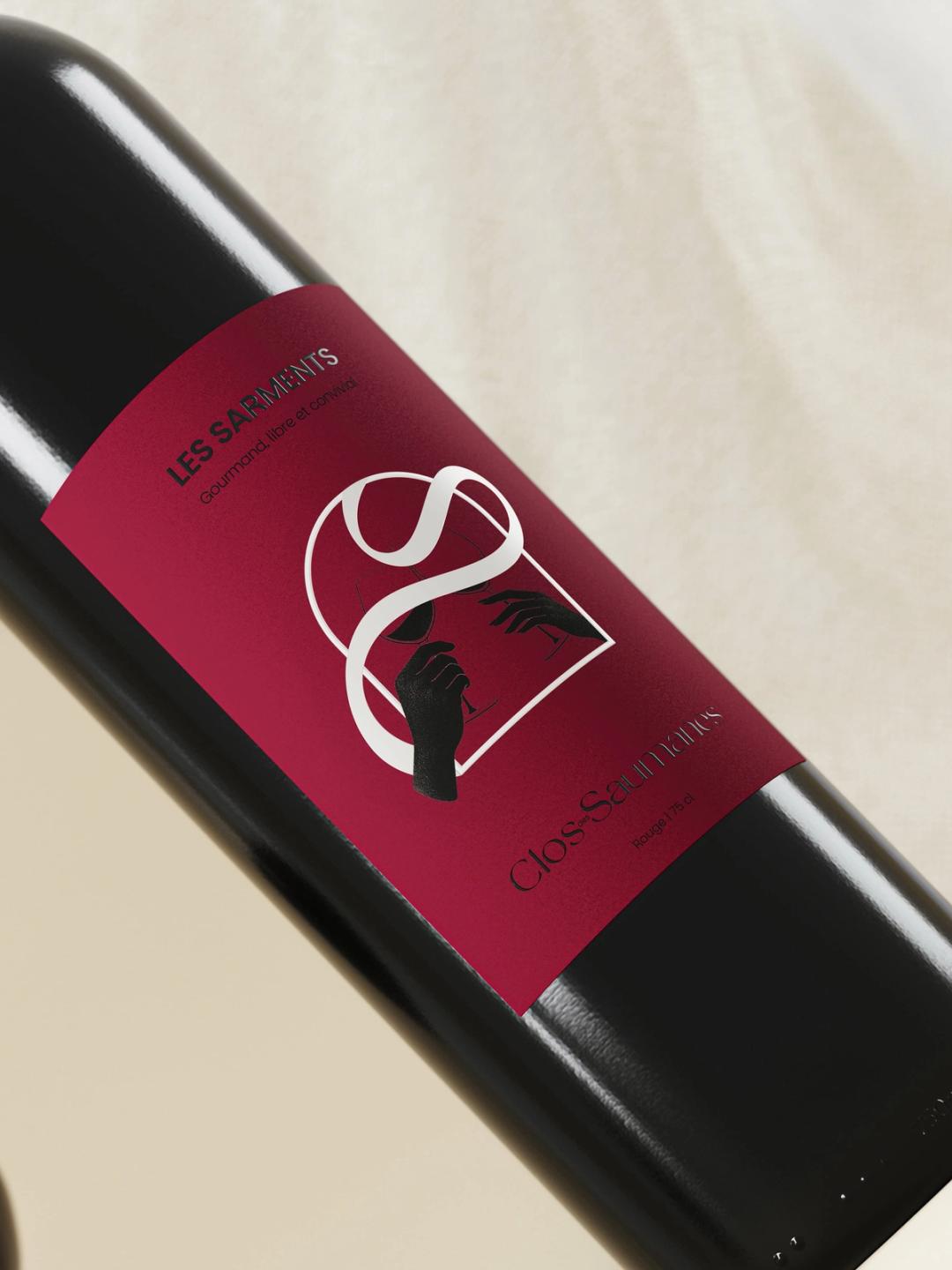
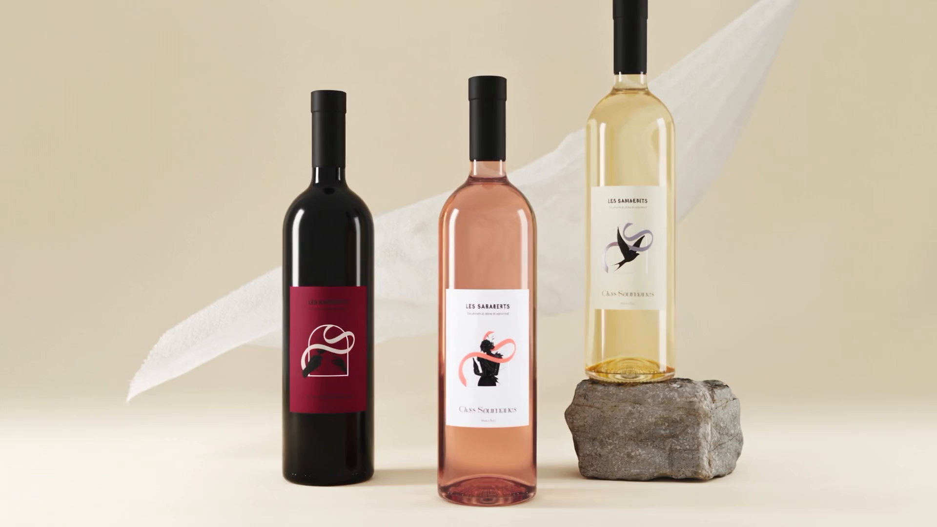
A C, an S, the movement of linen. The monogram takes only a few gestures. The arch echoes the cellar entrance. Two marks rooted in the estate, right down to the bottle.
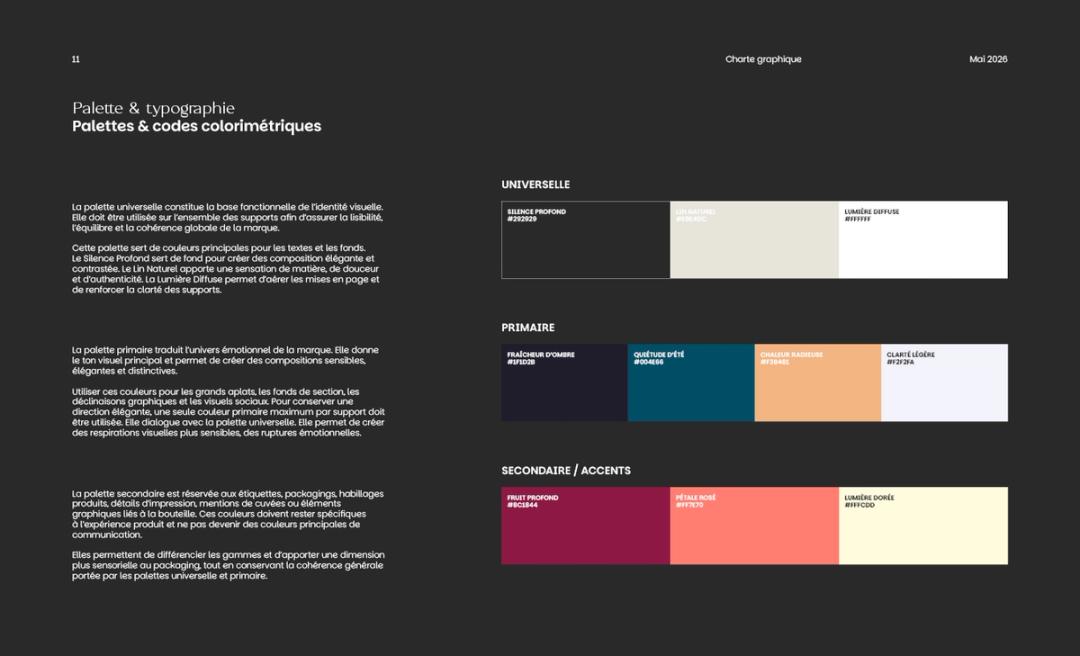
Colors pulled from the landscape.
Deep black, natural linen, soft light. A quiet foundation that gives the wines room. Warmer, fruitier and fresher tones distinguish the ranges without fragmenting the identity.
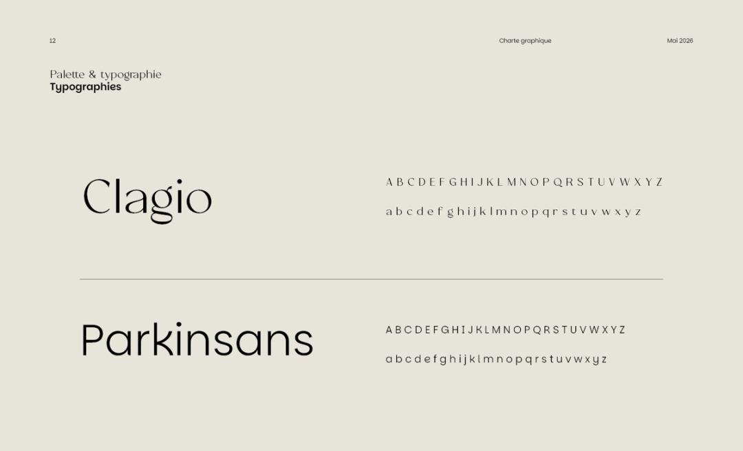
Two typefaces, one tone.
Clagio catches the eye. Parkinsans keeps things clear. Character in the headlines, clarity in the information. Two typefaces, one considered reading experience.
The South, without the postcard.
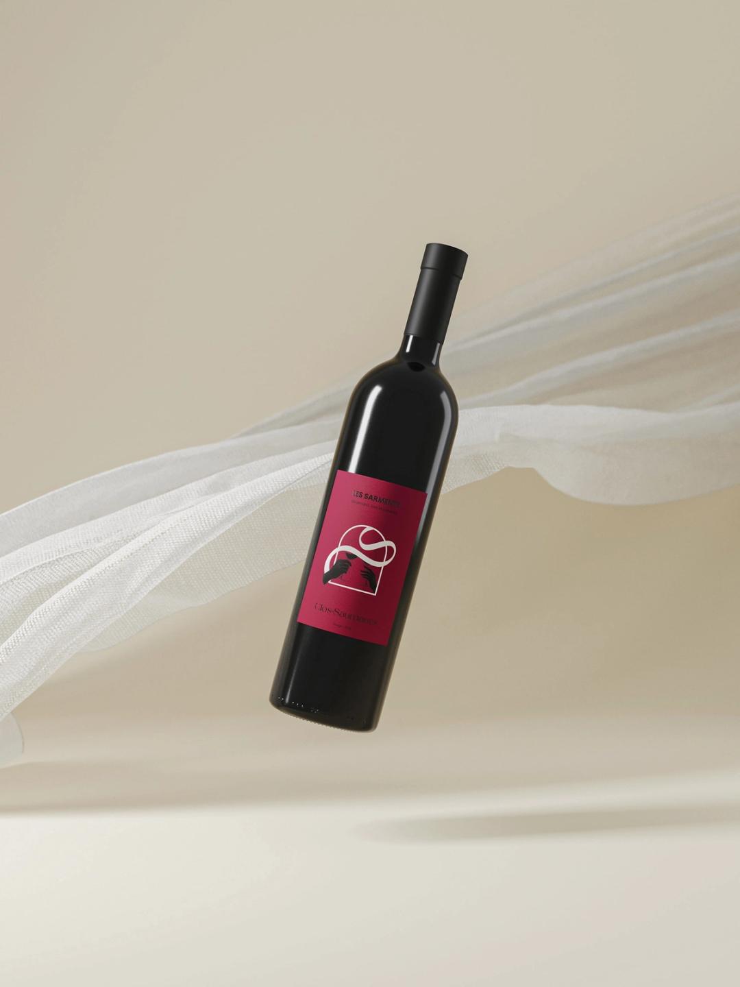
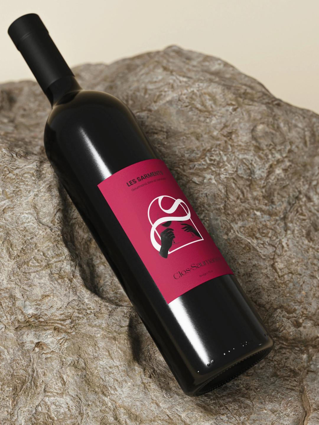
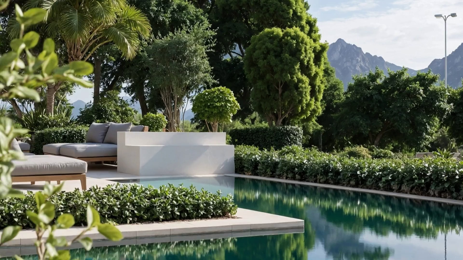
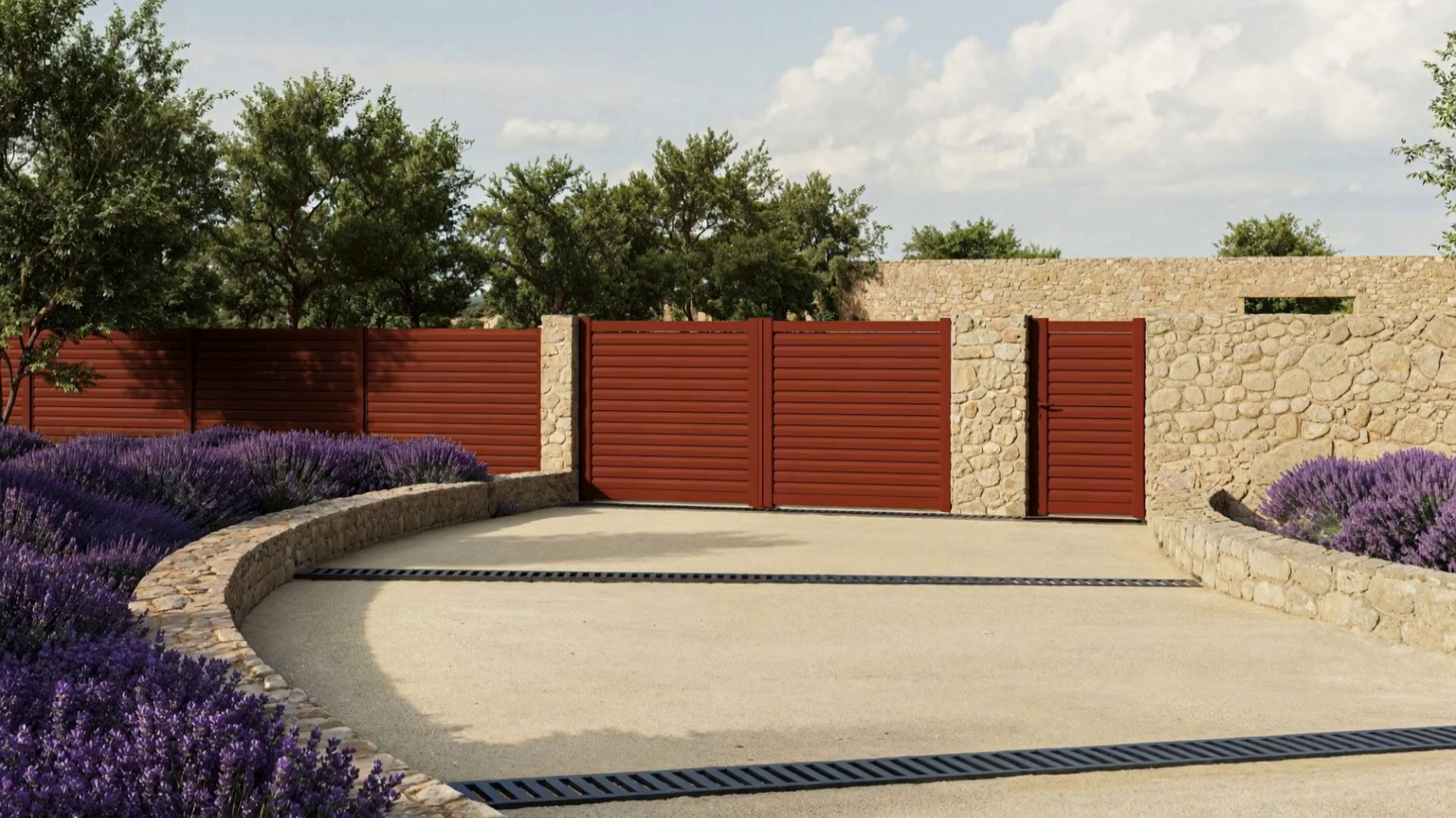
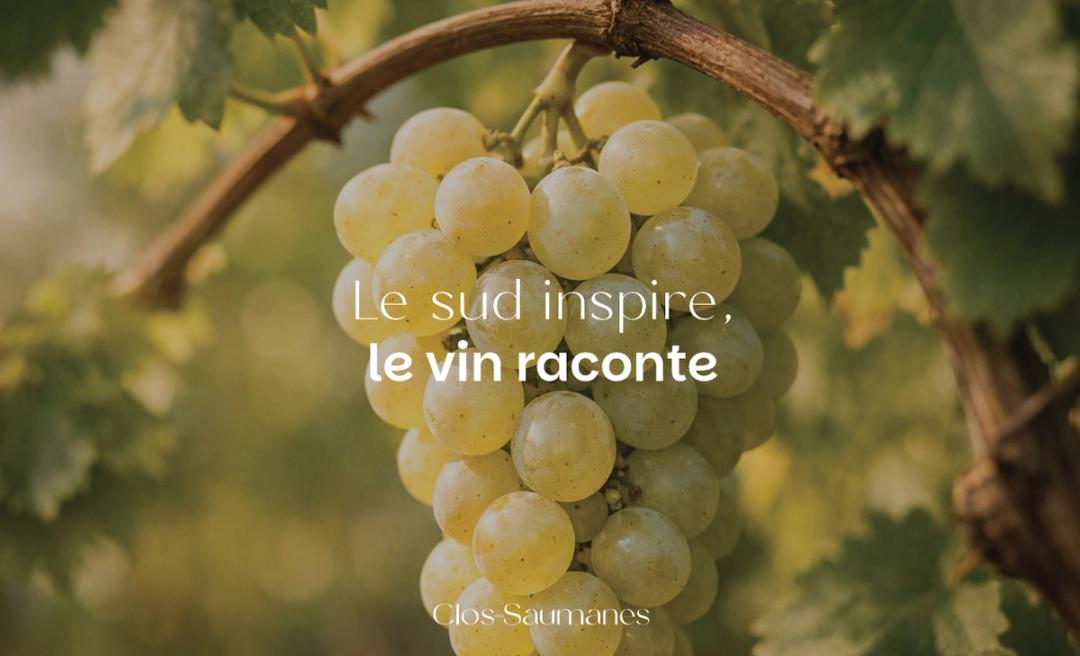
The South, without the postcard. Natural light, raw materials, shared moments. Wine is part of the occasion. The images hold on to the warmth of the place.
The brand becomes material.
Linen goes beyond the image. It guides the paper, grain, transparency and embossing. The identity has a tactile signature, too.
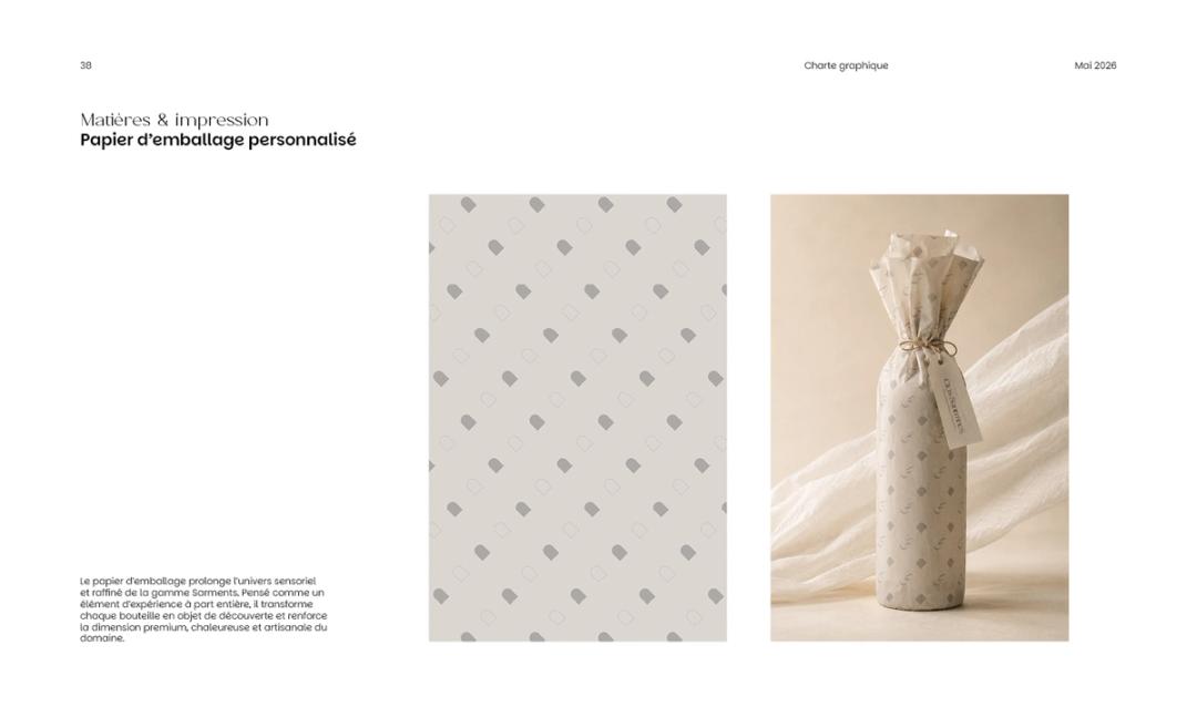
A brand you can hold.
On the bottle, everything comes together: mark, color, material, composition. The estate keeps its character on the shelf, in an image and at the table.